Responsive web design is a concept of developing a website design that the layout gets changed according to the user’s device screen resolution. To be precise, your website should be suitably fixed on any smartphone, tablet and computer screen.
Technically speaking, by using HTML and CSS automatically resize, hide, shrink or enlarge a website, so that it looks good on all devices.
Now you can test your website using the Website Responsive Tools.
Example of Non-responsive website vs Responsive website

Why is Responsive Design so important
With the growth of smartphones, tablets and other mobile computing devices, more and more people are using smaller-screen devices to view through web pages.
In April 2019, Google has announced that they will consider the mobile-first index as a major concern for search ranking, which means that – a website that has responsive design will have higher search ranking, compare to a website that doesn’t.
How Does Responsive Web Design Work
Responsive website uses fluid grids. All the page elements are sized by proportion rather than pixels. Media such as images will be resized relatively.
A mobile responsive web site includes design elements such as:
- Readable text without requiring zoom
- Adequate space for tap targets
- No horizontal scrolling
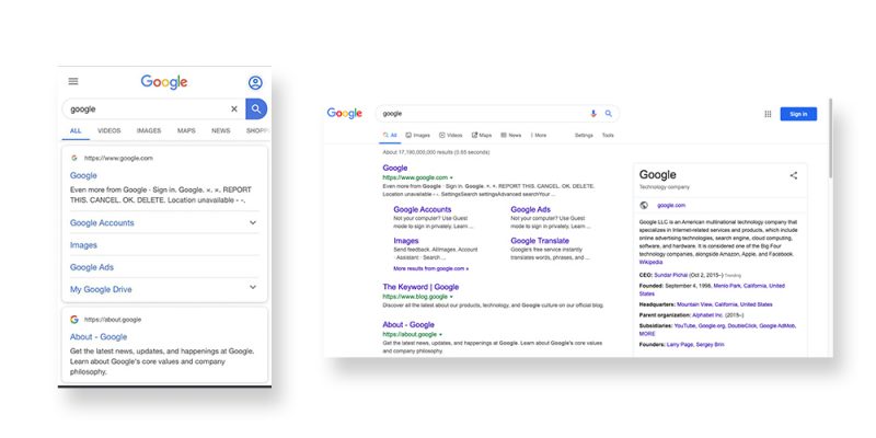
Example of responsive websites :
Google-mobile vs Google-Desktop

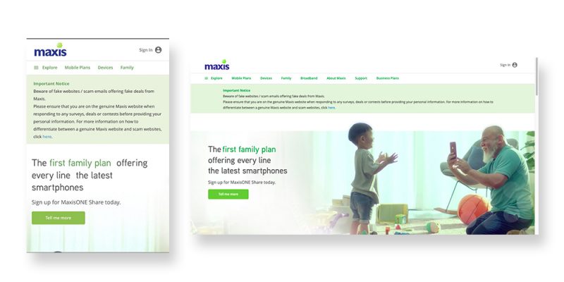
• Maxis
Maxis-mobile vs Maxis-Desktop

• Dot Connect
Dotconnect-mobile vs Dotconnect-Desktop

Conclusion
To ensure your website are able to offer an experience tailored to handheld devices, please make sure that your website is a mobile responsive website. Use Website Responsive Tools to test your site now.
Making your website mobile-friendly, definitely help to increase the amount of time that visitor will spend on your site and most importantly improve your ranking in search engines.
If you’d like us to personally help you, drop us a message here!
Prepared by: William
Published by: Hui Ying

